


Skip the Website Headaches: The DIY Guide That Actually Makes Sense
Picture this: You’ve just unboxed a brand-new IKEA bookshelf. The picture on the box is perfect. Your dream setup is within reach. But then you open the instruction manual, and suddenly, you’re staring at an abstract art piece of confusing diagrams and tiny screws that all look identical.
That’s what DIY-ing a website can feel like—unless you have the right template, the right mindset, and a plan that actually makes sense.
Most DIY website guides will tell you things like “Just choose a template and start designing!” But that’s like saying, “Just throw some planks together and—voilà—a bookshelf!” I’m here to give you the real, no-fluff, step-by-step guide that will not only save you time but also prevent you from rage-quitting your website halfway through.
Let’s do this—without the Allen wrench.
The Big Mistake Everyone Makes When DIY-ing Their Website
Most people think the hardest part of DIY-ing their website is making it look good. It’s not. The hardest part is knowing what you actually need before you even start.
A lot of new business owners pick a template, start dragging things around, and then wonder why their website feels chaotic and unprofessional. The truth? Your website isn’t just about aesthetics—it’s about strategy. It’s a digital storefront, a conversion machine, and a reflection of your brand, all rolled into one.
So, before you even log into Showit, ask yourself:
– What’s the #1 thing I want visitors to do on my site?
– What problem am I solving for my audience?
– What pages do I actually need? (Hint: You probably don’t need ten.)
Having clarity before you design is like having a clear instruction manual—it makes everything so much easier.
Step 1: Choose a Template Like You’d Choose an Outfit for a First Date
If you’ve ever tried to find the perfect outfit for a big date, you know the struggle. You want something that looks amazing, but also feels like *you*. That’s exactly how you should approach choosing a Showit template.
Don’t just pick the prettiest one—pick one that actually fits your brand’s personality and your business’s needs. If you’re a minimalist brand, don’t get a template filled with frills and florals. If you’re a bold, high-energy coach, don’t choose something soft and muted. Your website should match the vibe of your business, just like your outfit should match the occasion.
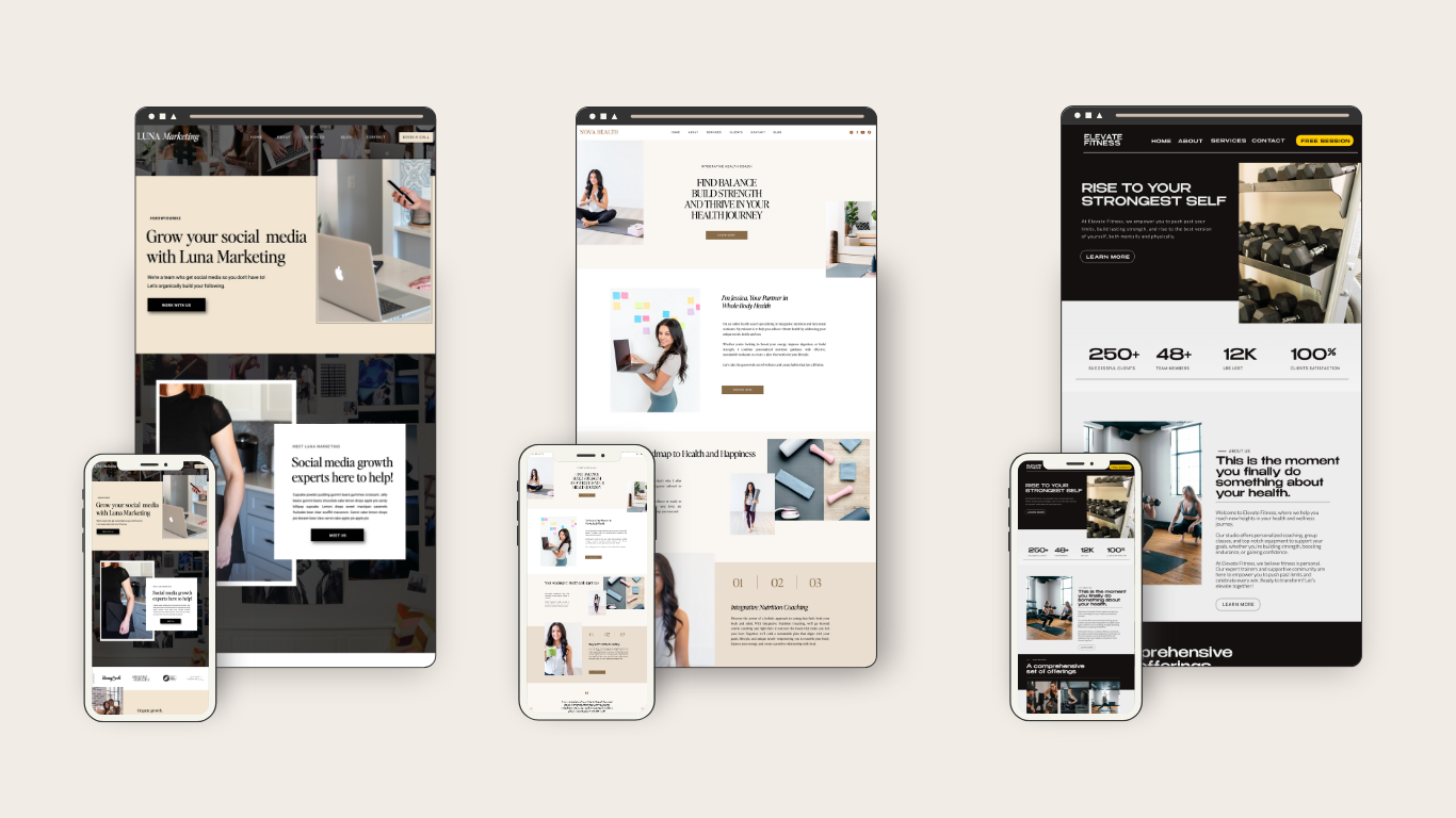
Step 2: The “Plug and Play” Myth—Why You Shouldn’t Just Swap Out Photos and Call It a Day
Here’s where a lot of people go wrong: They buy a template, replace the stock photos with their own, change the text, and call it done. That’s like buying a house, moving in your furniture, and never bothering to decorate or arrange the space in a way that actually makes sense for your lifestyle.
Your website template is a *starting point*, not the final product. You need to:
– Customize it to fit your brand colors, fonts, and personality
– Optimize it for conversions (AKA, make sure people know exactly where to click and what to do next)
– Ensure the messaging is clear, not just “pretty words” that don’t actually help your visitors take action
A great template saves you time, but it doesn’t do the work *for* you.
Step 3: Write Copy That Doesn’t Sound Like It Was Written by a Robot
Ever visited a website that says something like “We provide innovative solutions to help businesses grow”? Yawn. That tells me *nothing* about what you actually do or why I should care.
Your website copy should sound like *you*—not a generic business bot from 2009. Instead of stuffy, formal language, write like you’re having a conversation with your dream client. Use:
– Personality (yes, you’re allowed to have fun with it!)
– Clear, benefit-driven language (tell people what’s in it for them)
– Calls to action that actually make sense (“Work With Me” is better than “Submit Inquiry”)

Step 4: The “Oops, I Forgot Mobile” Trap
Let me paint a picture: You spend hours making your desktop site look amazing. You pat yourself on the back, hit publish, and then someone visits on their phone and—yikes. Nothing lines up, text is overlapping, and buttons are impossible to click.
Showit is *amazing* because it lets you design for mobile separately from desktop, but that also means you *have* to take the time to check and tweak both versions. More than half of web traffic happens on mobile, so don’t let your site be a hot mess on smaller screens.
Pro tip: Always test your site on *your* phone before you launch.
Step 5: Launch Before You Feel Ready (Because You’ll Never Feel Ready)
Perfectionism is the enemy of progress. I’ve seen so many entrepreneurs delay launching their site because “it’s not perfect yet.” Newsflash: It never will be. Websites are meant to evolve, so launch it, get feedback, and tweak as you go.
Think of your website like an iPhone. Apple doesn’t wait until they have the *perfect* version before releasing it—they launch, then update. Your website should be the same.
Final Thoughts: Your Website Should Work for You—Not the Other Way Around
At the end of the day, your website isn’t just a pretty online brochure—it’s a tool to help your business grow. A well-built Showit template gives you a head start, but it’s what *you* do with it that makes the difference.
So, embrace the process, don’t overcomplicate it, and remember—at least Showit doesn’t come with an instruction manual written in Swedish.
Now, go build that dream site (no Allen wrench required).


Comments +